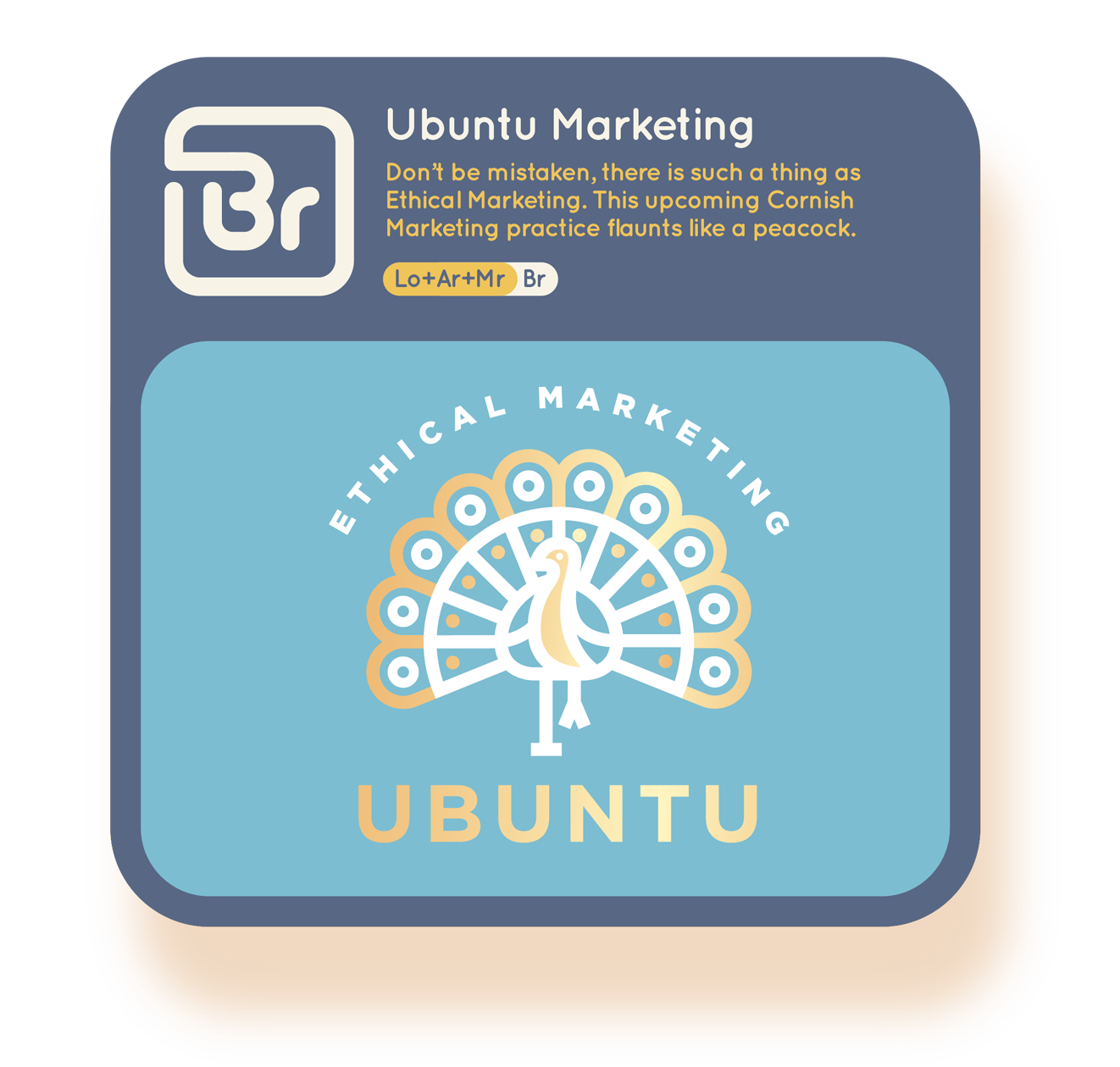
SERVICE OUTLINE

B R A N D I N G

We offer a truly tailored brand identity service that encompasses everything from the initial and essential logomark through to web design should you require it.

Understanding your brand, its values + direction is at the core of our branding service. we don’t just chuck some cookie cutter concepts at you, we tailor every element so it can represent your brand or product in the best way possible.

Asset 135@6x.png
Asset 222@6x.png

BRANDING SOLUTION

Ubuntu Marketing

Don’t be mistaken, there is such a thing as Ethical Marketing. This upcoming Cornish Marketing practice places emphasis on ethical choices + strategies and helps your business flaunt it!

We keenly deliberated on the most suitable graphics to style Ubuntu and settled on a Peacock, which is known for flaunting it and doing so impressively, which is what this company strives to do.

The project involved logo, type, artwork, pattern, print + web. Works began on paper with successful concepts explored digitally where we introduced geometry, colour + text. As is tradition in the way we work, we went above and beyond when formulating the files our client may require including multiple variants for every usage occasion.

ubuntureport2.png
Asset 85@6x.png
 
Asset 223@6x.png

BRANDING SOLUTION

Solana Harvest

These guys are leading the way in supplying the healthiest, freshest fruit + veg from farm to table in India. Their focus is to build a rapport with their customer base that instills trust in their service and their produce.

Abraham and the team gave us a fair sense of free reign but they did want the brand to feature a scene that captured where the produce comes from. We settled on a design that featured a rustic arched wooden plaque over a simplistic valley scene surrounded by various produce. A design that contains a lot of graphical elements but manages it with a carefully considered amount of detail and great spacing.

Solana Harvest were equipped with various logo variants, font collections and graphical assets as well as a few packaging solutions and marketing materials.

solana-report.png
Asset 90@6x.png
 
Asset 224@6x.png

BRANDING SOLUTION

Quanto

Think MachineMart, but in India only better. Quanto is in the early stages of development but has big plans in the tool sector for the Indian Market.

Key words to exude in this brand development were refinement, precision, solidarity, distinction, masculinity + quality. The client required a wordmark that was simplistic and bold which gave us plenty of constraint when creating something beautiful and original. After developing balanced custom created lettering for the wordmark, emphasis was placed on detailing the letters to pop them off the page and give them a sculptural look.

Strokes, shadows, highlights and gradients were introduced which collectively gave the design a twisted, carved metallic feel which drew the viewer in to the consideration the brand had made for detail.

quantoreport2.png
Asset 94@6x.png
 
Asset 83@6x.png

 BRANDING SOLUTION

The Cornovii

A tribe that lived in the area now known as Cornwall. Cornwall life and travel resource via film, image and article.

The Cornovii is an exciting new movement for lifestyle in Cornwall telling their stories via film, photo, artwork + blog. It’s difficult to find a creative visual niche in Cornwall but we wanted to touch upon an abstract feel with the structure of real perspective. Applying this logic to the iconic Cornish Engine House synonymous with the skyline of Kernow, we had the perfect, memorable and relatable logo.

The logo work was supported with a refreshing colour palette, careful type consideration, social media design language and a set of bespoke, original artworks which can be seen on the artwork section of our site.

cornoviireport.png
Asset 99@10x.png

Our clients can be found as far afield as Australia, but we particularly love working with local brands in Cornwall. If you have a project in mind, we’d love to hear all about it!


Asset 135@6x.png